Malta Tourism Authority
Malta Tourism Authority
Malta Tourism Authority
Brand
Client
MTA
Creative
Brand Identity
Malta Brand Identity: A Celebration of Heritage and Discovery
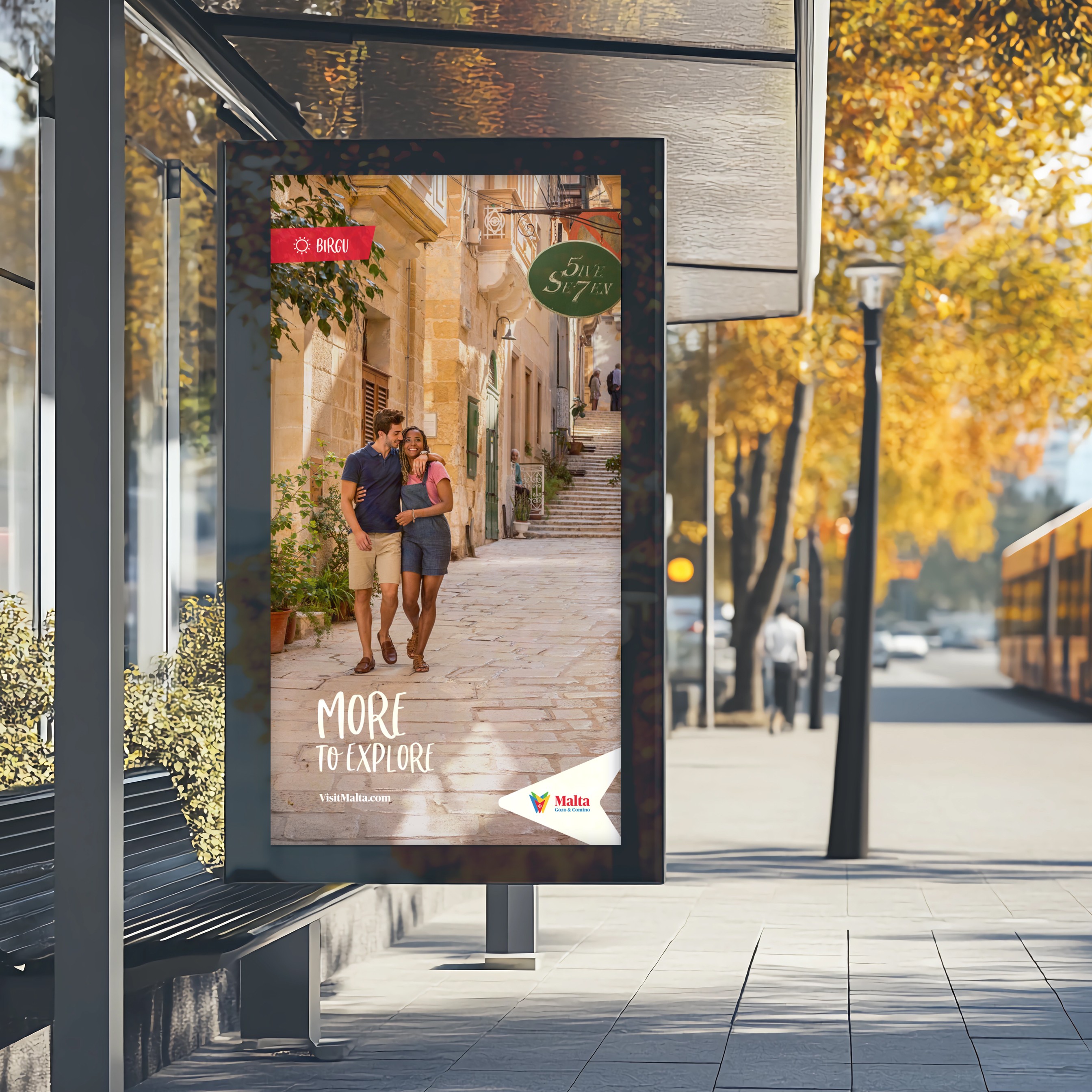
The new Malta brand identity embodies the spirit of discovery and adventure, encapsulated by the brand position: "More to Explore". This tagline underscores the promise that every visit to Malta is a unique journey, filled with fresh experiences and untold stories.
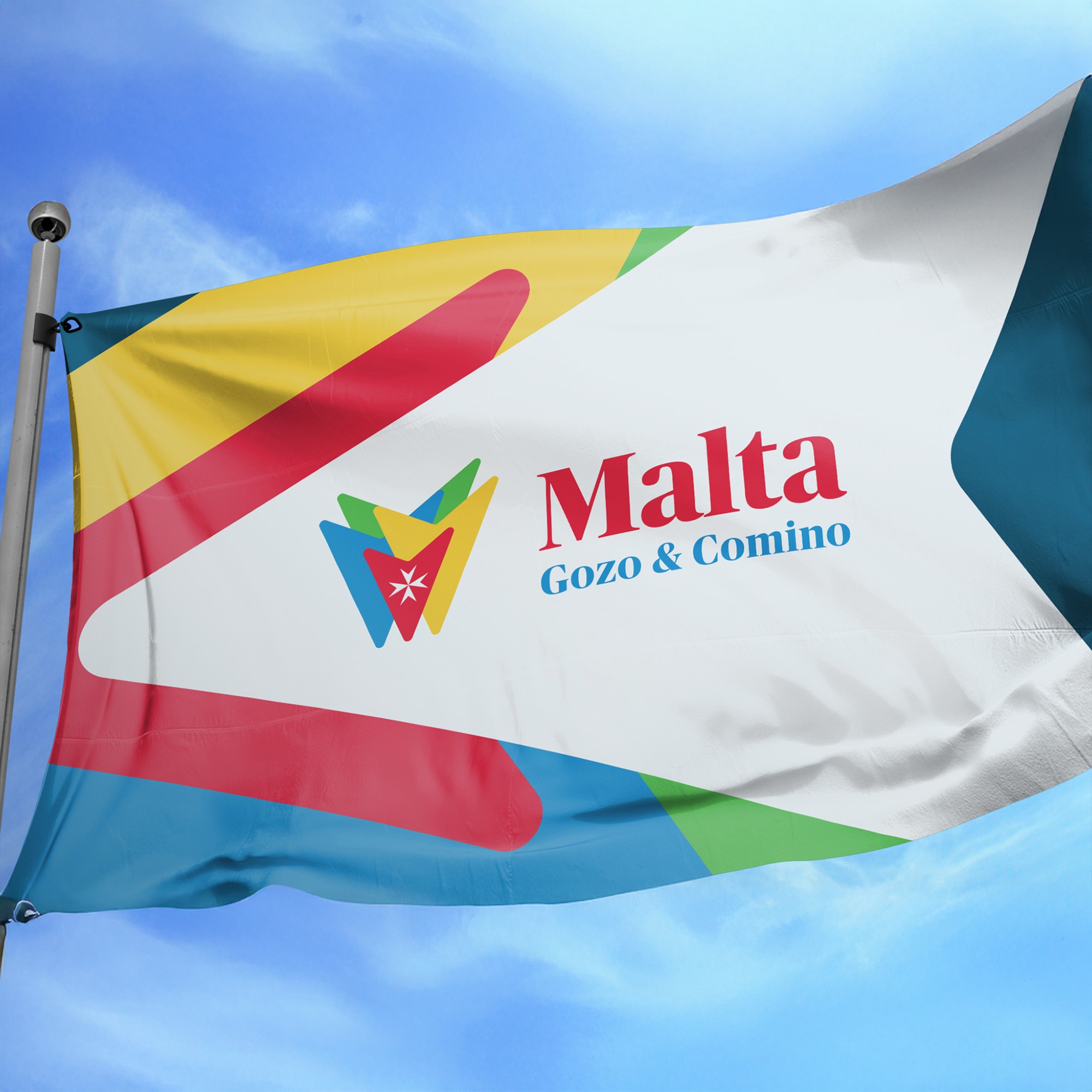
At its core, the identity reimagines the iconic Maltese Cross, infused with vibrant colours inspired by the traditional Luzzu fishing boats—red, yellow, blue, and green. These hues represent Malta’s sun, sand, sea, and land, creating an inviting gateway to the islands’ diverse offerings. The design’s fluidity evokes movement and connection, symbolising how Malta brings people together to celebrate life, culture, and nature.
Symmetry, a hallmark of the Maltese Cross, reflects Malta’s harmonious blend of history and modernity. Red, positioned at the centre, represents the country’s flag and its role as the heart of the Mediterranean. Each island—Malta, Gozo, and Comino—finds its place within this dynamic palette, reinforcing the sense of unity and diversity.
This identity captures Malta as a nexus of cultures, inviting visitors to discover their own Malta story. With endless opportunities for exploration and renewal, the brand encourages travellers to return time and again, ensuring Malta’s allure as a destination remains timeless and ever-evolving.


