Naples - Slice of Naples
Naples - Slice of Naples
Naples - Slice of Naples
Brand
Client
Slice of Naples
Creative
Brand Identity
Slice of Naples Brand Identity: Where Heritage Meets Innovation
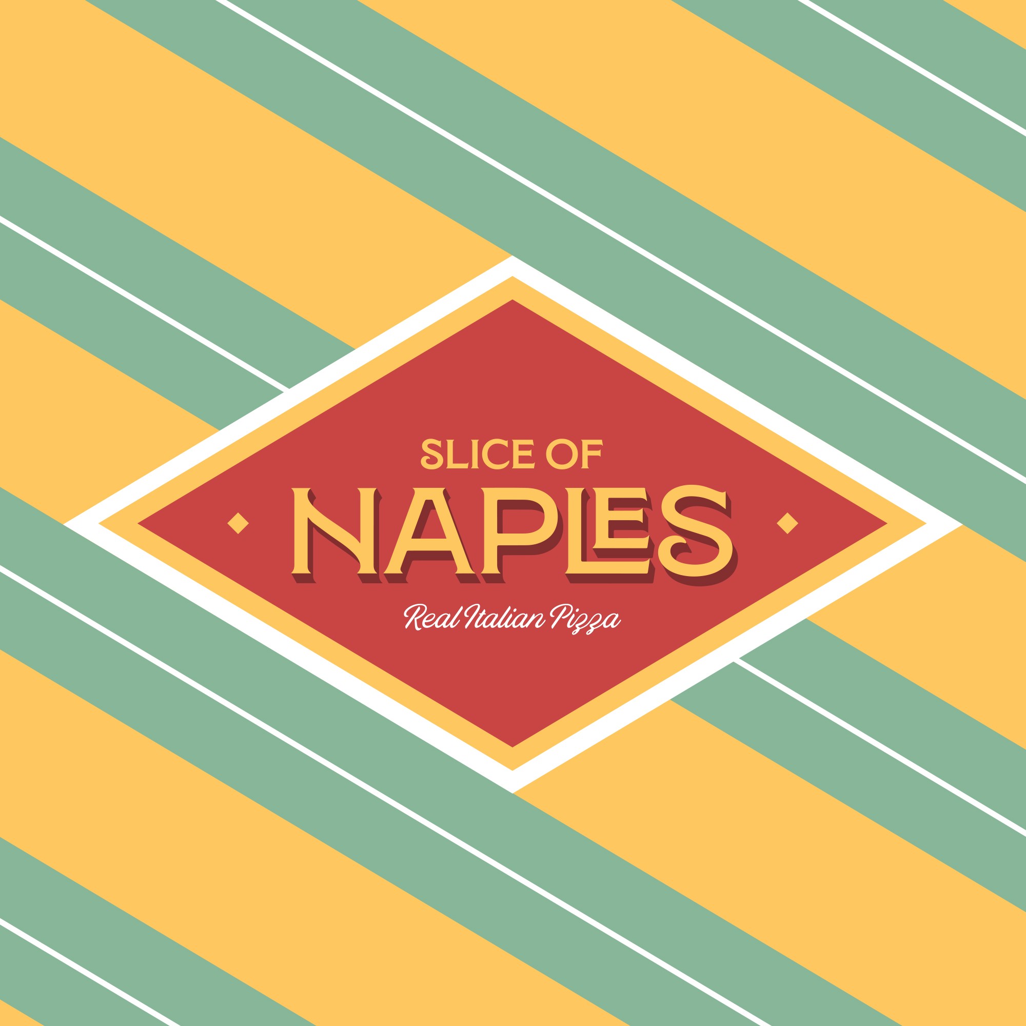
Slice of Naples brings authentic Neapolitan flavours to life with a brand identity deeply rooted in tradition yet boldly modern. Drawing inspiration from the flag of Naples, the design features vibrant reds and yellows, complemented by green stripes that create a distinctive and striking pattern. This colour palette symbolises the high-quality ingredients—from bright tomatoes and golden mozzarella to fragrant basil—honouring both the region’s heritage and its celebrated cuisine.
Despite paying homage to its roots, Slice of Naples adopts an honest and disruptive approach that differentiates it in a crowded market. Minimalist layouts and unapologetically bold typography emphasise the brand’s unwavering commitment to quality over gimmicks, while the dynamic interplay of red, yellow, and green reflects the passionate spirit of Neapolitan food culture.
Subtle nods to Naples itself—whether referencing the city’s iconic streets or Mount Vesuvius—bridge old-world authenticity with modern flair. By incorporating 0.0 flour and fresh, authentic sauces, Slice of Naples showcases its dedication to genuine Neapolitan methods. This deliberate blend of heritage, striking visual patterns, and contemporary design ensures that Slice of Naples stands out as an exciting, forward-thinking pizzeria, while staying true to the soul of its birthplace.


